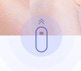
按钮效果图
具体css实现代码
.bs-fdicon{ position:absolute; left: 50%; bottom: -43px; width: 85px; height: 85px; margin-left: -43px; z-index: 10; }
.bs-fdicon a{ position: relative; display: inline-block; width: 85px; height: 85px; z-index: 11; cursor: pointer;}
.bs-fdicon img{ position: relative; display: block; width: 85px; height: 85px; border-radius: 50%;}
.bs-fdicon a:after{ content:''; position: absolute; left: 0; top: 0; z-index: 1; width: 85px; height: 85px; border-radius: 50%; background: rgba(176,186,254,0.3); animation: sploosh 2s linear infinite;}
.bs-fdicon a:before{ content:''; position: absolute; left: 0; top: 0; z-index: 2; width: 85px; height: 85px;  border-radius: 50%; background: rgba(176,186,254,0.3); animation: sploosh2 2s linear infinite;}

@keyframes sploosh {
  0% {
    box-shadow: 0 0 0 0px rgba(176,186,254, 0.5);
    background: rgba(176,186,254, 0.3);
  }
  100% {
    box-shadow: 0 0 0 30px rgba(176,186,254, 0);
    background: rgba(176,186,254, 0.1);
  }
}

@keyframes sploosh2 {
  0% {
    box-shadow: 0 0 0 0px rgba(176,186,254, 0.5);
    background: rgba(176,186,254, 0.3);
  }
  100% {
    box-shadow: 0 0 0 60px rgba(176,186,254, 0);
    background: rgba(176,186,254, 0);
  }
}